In short
A dashboard can be accurate, polished and regularly updated without changing a single decision. It describes the situation but leaves service leads with the hardest work: deciding what deserves a response, choosing what to do and checking that the choice made a difference.
To become useful, every prominent measure should connect to a real decision, a clear warning point and someone who can act.
A simple picture
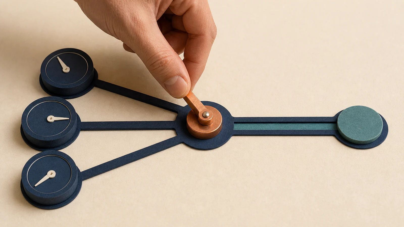
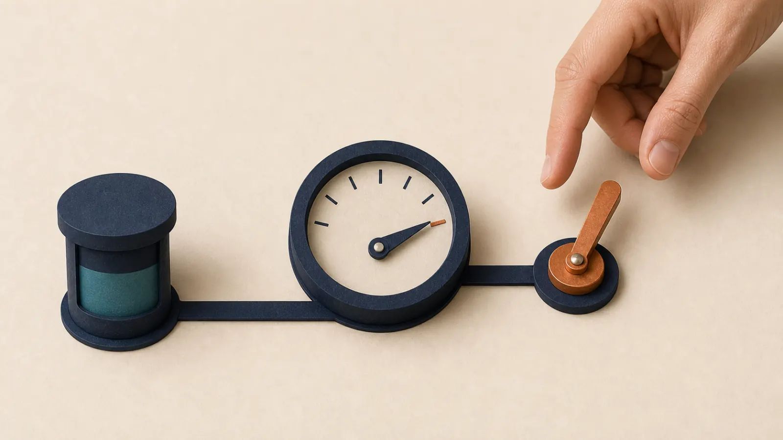
Picture a panel with several dials and a lever beside them. The dials show pressure, speed and temperature. They help people see what is happening. But if nobody knows which dial matters, when to pull the lever or what the lever controls, the panel protects nothing.
A good dashboard connects the dials to the lever. Its purpose is not simply to inform. It makes clear when something needs to change, who can change it and what result to expect.
Idea 1 — Choose the lever before the dial
Dashboard discussions often begin with the data already available. A better place to begin is the decision that comes up every week or month. Should the team add help, change a deadline, turn down a request or warn a customer?
Once the choice is named, the useful measure becomes easier to see. When deciding whether a team can accept a new request, the total number of tickets says less than the work already promised, the time available and the dates that cannot move. Starting with the lever prevents a collection of impressive dials that nobody uses.
Idea 2 — Mark the point at which action is needed
A dial with no marker invites everyone to make up their own reading. Is a five-point fall normal, concerning or urgent? The dashboard should show when a conversation becomes necessary and when a decision can no longer wait.
Context matters as much as colour. A rising average response time may be caused by one very old case or by slower handling across every case. A short sentence explaining the likely cause and the expected consequence is often more helpful than another chart. It allows the service lead to understand what is at stake before touching the lever.
Idea 3 — Check that the lever actually moved something
A decision announced in a meeting is not yet a result. Record who will act, by when and what change will show that the action worked. Without that simple note, the same dial turns red and the same conversation starts again the following month.
Consider a delayed release. The team decides to reduce the contents of the next release to keep a customer date. At the next review, it does not merely check that a list was edited. It checks whether the planned workload actually fell and whether the date is now credible. The lever remains connected to the dial.

Putting it into practice
Take the first page of your current dashboard and circle its five most prominent measures. For each one ask: what decision could this number change? At what point must we act? Who can make the call? When will we see the effect?
If nobody can answer, move the measure to a supporting page or remove it. Then choose one frequent decision that is still difficult and build a simple page around it: no more than three numbers, a short explanation, two realistic choices, one named person and one date.
Takeaway
The dials show what is happening; the lever changes it. A good dashboard connects the two and helps managers act in time. To turn a crowded review into a useful working session, let’s talk.